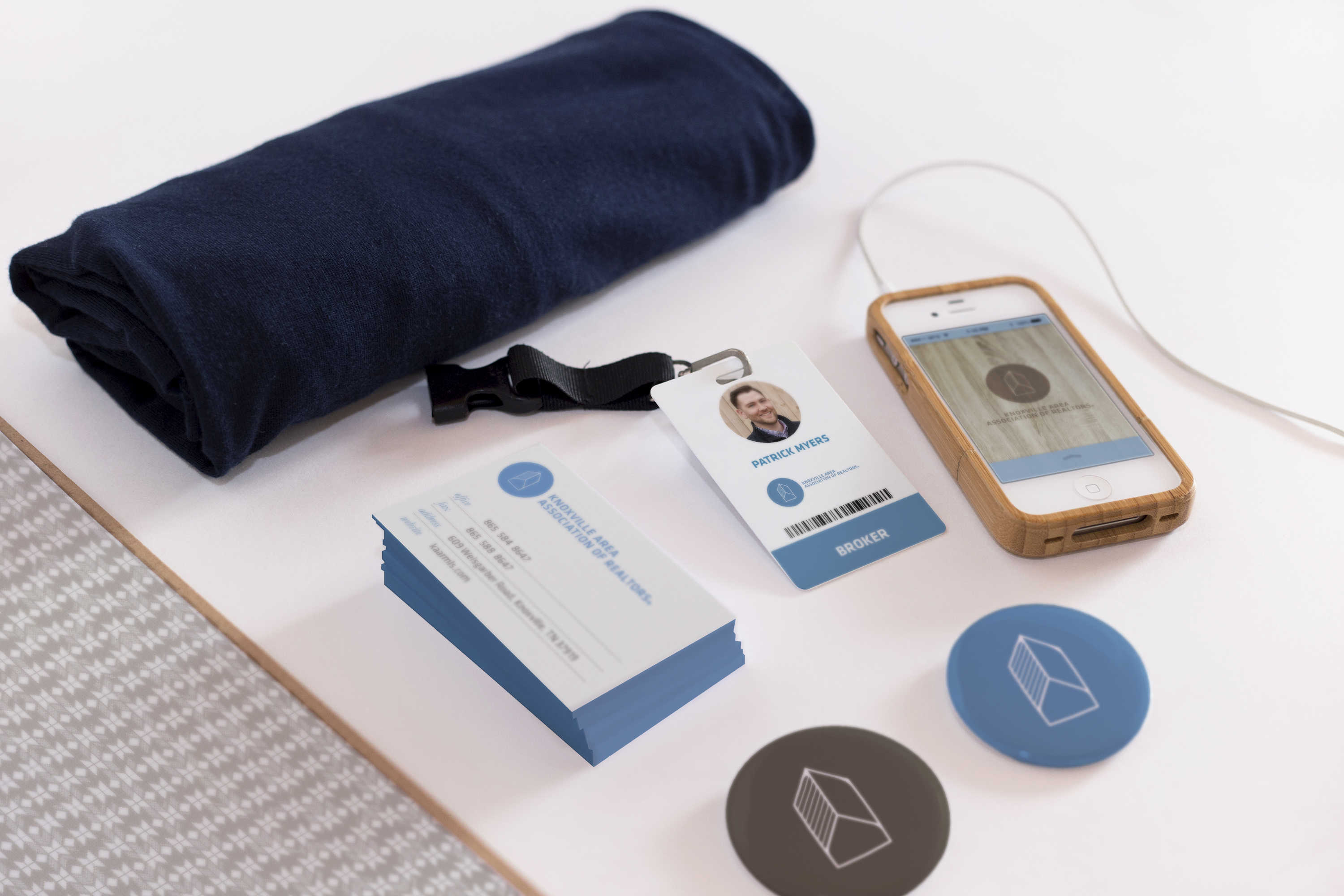
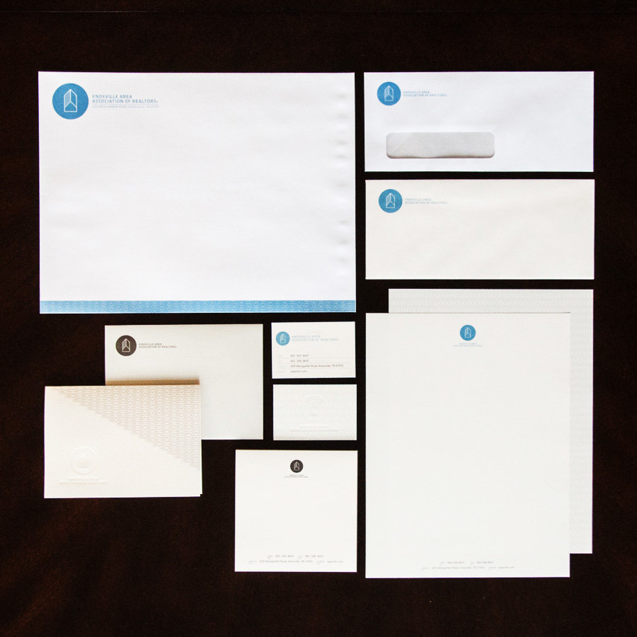
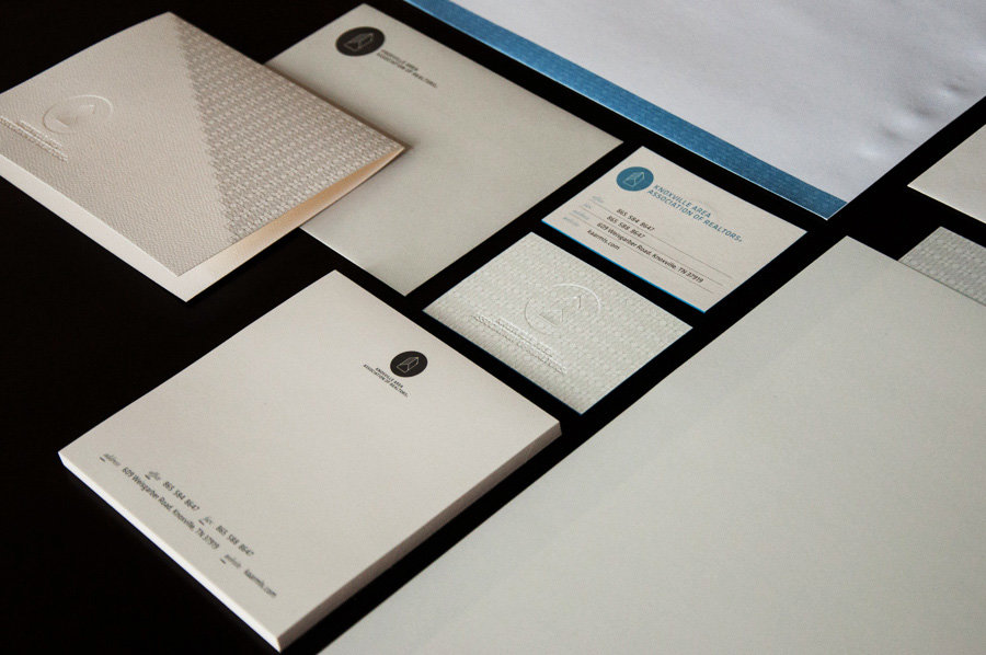
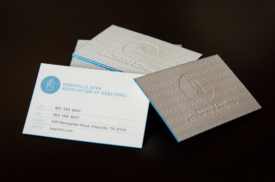
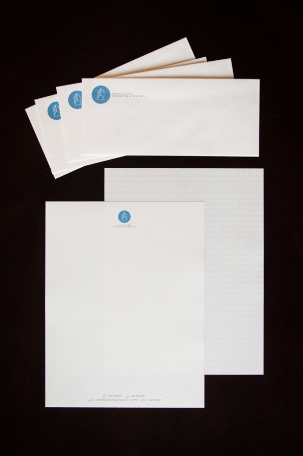
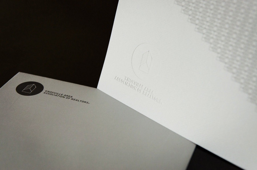
The Knoxville Area Association of Realtors (KAAR) organization realized they needed a new look, they researched their options, and prior to engaging the services of Relise Design Co. had a number of frustrating and costly experiences often found with inadequate designers.
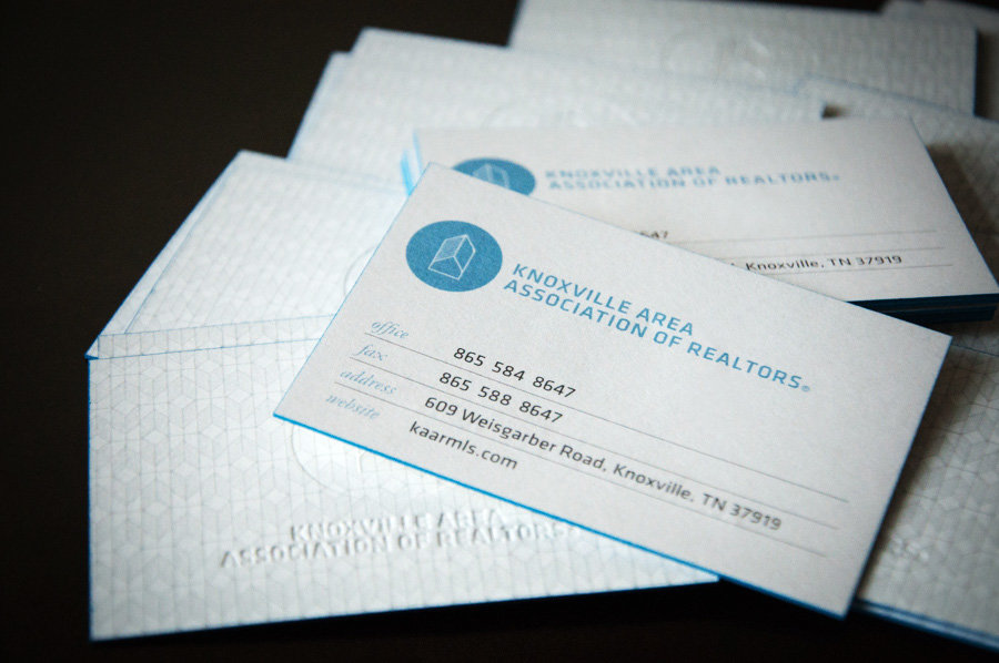
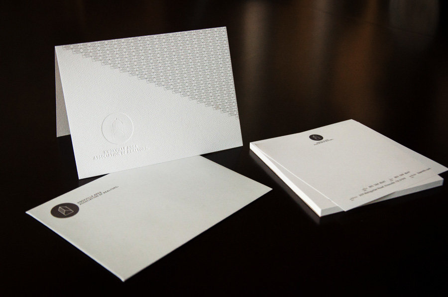
We worked alongside side by side with the KAAR director and team to establish a fundamental premise for the new brand that would cater to both residential and commercial markets, and retain a timelessly luxurious clean look and feel.
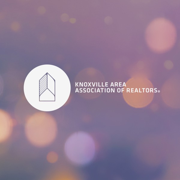
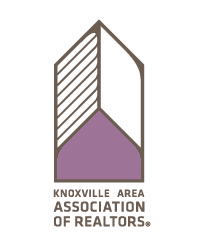
When looking at the logo itself you can see what appears to be a tall commercial building, at the base there is noticeable “house”, and if one accounts for the shading on the left half the logo becomes a long house or warehouse. The delicate lines and rounded interior corners are design cues popular to the midcentury modern design period that KAAR is modeling their new facility after.

